| Image |
Comment |
| 04/21/2013 11:16:26 PM |
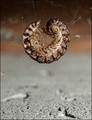
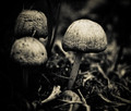
Suspendby TonyTComment: Oops. I like where this was going. Could have used a little more post processing, I think... clone out some bits of yuck towards the ground and make the whole scene a bit more stark to help carry the weight of the subject.
Over all, a very good entry. |
 Photographer found comment helpful. Photographer found comment helpful. |
| 04/21/2013 11:14:12 PM |
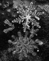
Snowflakes!by BuddyBaumComment: Love this... Did you have to use a reversed lens? I think I might have liked this more if you had cropped to just to the top flake... Good job, though. |
| Photographer found comment helpful. |
| 04/21/2013 11:13:11 PM |
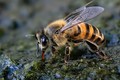
caught in the actby rozComment: Great capture and good detail.
Light is too focused. Did you use a flash? If so, something like this might help next time :  |
| Photographer found comment helpful. |
| 04/21/2013 11:13:04 PM |
Fantasiaby JudiComment: Lovely. Nice color in the background and good bokeh. The strands feel a little too chaotic and less "wispy", but over all very cool. |
| Photographer found comment helpful. |
| 04/21/2013 11:13:01 PM |
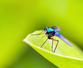
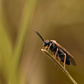
Viridian Vermin by pambComment: I love the color of the fly against the green. Very electric...
I do wish the front edge/point of the leaf wasn't so overexposed looking.
Great capture. |
| Photographer found comment helpful. |
| 04/21/2013 11:11:20 PM |
|
| Photographer found comment helpful. |
| 04/21/2013 11:11:17 PM |
Quenching her thirst by kasabaComment: A lot of good competition, but I'm expecting a high placement on this one... Good job Gaby...
(comment only) |
| Photographer found comment helpful. |
| 04/19/2013 04:24:30 PM |
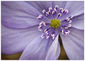
Gently Foldedby SaraRComment: Only thing I can say is that I might have liked to see it a bit brighter...
Very lovely. |
| Photographer found comment helpful. |
| 04/19/2013 04:05:55 PM |
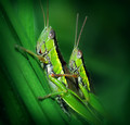
Big Big Worldby cynthiannComment: I still prefer the bright green background, but either way, it is quite a cool little critter... Good job!
(comment only) |
| Photographer found comment helpful. |
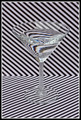
| 04/19/2013 04:04:22 PM |
:: Stripes ::by P-A-U-LComment: I think this shot is more interesting because it does not have bright colors. Certainly an intense study in refraction. Great idea...
A few details jump out to me that could have made this better.
1) Watch your horizon. Nevermind... I just pulled it into an editor to check and it is level. I guess the diagonal lines just make it look unlevel, and to voters, perception is reality.
2) The power in this (to me) is that it's not colorful. In that, I would have converted to B&W because I find the blue and orange bits in the refraction to detract.
3) The reflection off the front of the glass is distracting. It makes it too busy. Would a polarizer have helped? I think so... This, of the three, would have helped most, I think.
Of course, having looked at this for this long, I now find myself slightly dizzy. ;) |
| Photographer found comment helpful. |
Home -
Challenges -
Community -
League -
Photos -
Cameras -
Lenses -
Learn -
Prints! -
Help -
Terms of Use -
Privacy -
Top ^
DPChallenge, and website content and design, Copyright © 2001-2024 Challenging Technologies, LLC.
All digital photo copyrights belong to the photographers and may not be used without permission.
Current Server Time: 04/24/2024 09:59:51 AM EDT.