| Image |
Comment |
| 08/10/2003 10:57:53 PM |
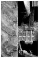
Horsepowerby AaronComment by HBunch: *Critique Club*
Well, The first thing I notice is that there is a bit of background here. The black area looks to be background to me. While it is not distracting, I do think that a challenge titled 'fill the frame' should not really have any background. This is only the way I personally interpreted the challenge, and since I didn't vote, that doesn't matter too much anyawy.
I think that your focus and clarity are really good. I can see a lot of detail here, from the tread on the tire right down to the screw thread on the vertical bars near the middle of the photo. Very nice detail, and great focus to accomplish such detail.
The lighting to me seems good as well. I wonder though how it would look with a bit of shadow on the tire to help the tread stand out just a little bit more? Otherwise, I see no bright spots or distracting shadows.
The framing and cropping are a major part of this challenge, and as I said before, while it doesn't really fit the 'fill the frame' in my opinion, I do like the framing/cropping very much. The closeness is nice and also helps to make the details stand out. I really like the tire to the left, but maybe it leaves the photo just a little unballanced? Kind of like the left side is a little heavy and the right side doesn't really contain a lot of info.
Overall a nice shot with lovely detail.
~Heather~ |
 Photographer found comment helpful. Photographer found comment helpful. |
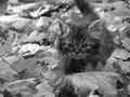
| 07/14/2003 12:33:58 AM |
breezy.jpgby AaronComment by Sonifo: That kitty looks so small compared to those leaves. Great shot, Aaron! |
| Photographer found comment helpful. |
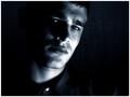
| 06/07/2003 01:53:10 PM |
Pensiveby AaronComment by indigo997: Hmmm... My main issue with this picture was the lighting, but your other comments suggest that atleast those who commented mostly liked it. I don't like blown out areas. They just draw the eye and distract from the rest of the shot. Perhaps you did it on purpose, but did you try diffusing the light with some cloth or bouncing it off something so that it wouldn't be so harsh in those places?
Other than that.. I like this shot. I like the crop and composition. I like how there's more space on one side than the other. I like how the darkness envelopes the subject. A tad more light on that one eye would be nice.
I also don't like the white button, but it isn't a big deal.
Overall it's a strong picture that went up against some very great shots. I personally think that it would've done better without the hot spots. Focus looks pretty good to me. The most important thing with portraits is to have the eyes in focus and they seem to be.
|
| Photographer found comment helpful. |
| 05/29/2003 10:11:37 AM |
Pensiveby AaronComment by eloise: The lighting on the cheek/neck is very harsh, and distracts the attention from his expression. This is a coulda-been-great that is instead just kinda neat. Good concept. Better focus and lighting might well have gotten a 10 from me; as it is, 7. |
| Photographer found comment helpful. |
| 05/27/2003 02:03:46 AM |
Pensiveby AaronComment by mcmurma: Great lighting (if just a touch hot on his cheek and brow). Nice work. |
| Photographer found comment helpful. |
| 05/26/2003 10:31:00 AM |
Pensiveby AaronComment by justine: Nice work, good light. Button is a distraction for me..but it's good shootin'!! |
| Photographer found comment helpful. |
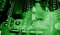
| 05/25/2003 11:21:14 PM |
Takeoverby AaronComment by Journey: Very slick. Very creepy. I like it! I might have cropped some of the black on the left off because it shifts the overall balance to the left away from the face. Then again, the image isn't just about the face. Some of the light lighting around the nose and cheek bother me a little but i'm very forgiving when i'm being pleased.
BTW, normally i leave a score with my comments and i had forgotten it here. It got a 9 from me (update 5/28) Message edited by author 2003-05-28 21:23:50. |
| Photographer found comment helpful. |
| 05/22/2003 04:43:38 AM |
Takeoverby AaronComment by e301: The angle of the circuit-board really upsets the composition for me: doesn't seem to gain anything by being tilted like that. Like your interpretation of the challenge though - especially like where the face merges into the pcb. |
| Photographer found comment helpful. |
| 04/16/2003 12:37:03 AM |
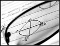
What's Pi doing in Radian?by AaronComment by indigo997: Interesting. I like this shot for its technical/graphic aspects more than the artistic/aesthetic. The black and white is nice. So is the composition, lighting, and contrast. I would also prefer the focus to be a little more even - without the shadowy area on the bottom half of the lens. Nice diagonal.
This was a tough topic, and I think that the voters really appreciated creativity just because they had such a hard time coming up with any ideas themselves. Technically, this is good and probably should've scored a bit higher. I think that the idea is as important as the ability. Your ability is good which puts you in about the same spot as a lot of us... just waiting on creativity to strike :) |
| Photographer found comment helpful. |
| 04/10/2003 10:12:19 AM |
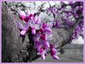
Virginia Redbudby AaronComment by kiwiness: Awesome colors! The B&W background effect enhances the colors even more. Shallow DOF also works here. Maybe the purple border is too much of a good thing though? |
| Photographer found comment helpful. |
Home -
Challenges -
Community -
League -
Photos -
Cameras -
Lenses -
Learn -
Prints! -
Help -
Terms of Use -
Privacy -
Top ^
DPChallenge, and website content and design, Copyright © 2001-2024 Challenging Technologies, LLC.
All digital photo copyrights belong to the photographers and may not be used without permission.
Current Server Time: 04/23/2024 05:32:48 PM EDT.