| Image |
Comment |
| 07/26/2004 11:22:49 PM |
Drunken Party Cricketsby md8speedComment: Awesome picture. I'm not a huge fan of the graphical layout, but I do like your color choices. Overall nice job. |
| 07/26/2004 11:20:07 PM |
Dark Pier Creek by hopperComment: The tones are really stunning in this photo. I'm not crazy about the text. I think the drop shadow's a little heavy, and it'd be neat to have the text sit a little softer on the composition. Wonderful job, though, overall. Great band name, and the photo is definitely the highlight. 9. |
 Photographer found comment helpful. Photographer found comment helpful. |
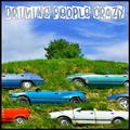
| 07/26/2004 11:18:21 PM |
Driving People Crazy!by BassieComment: Very well done. If you've had this subject waiting for the right challenge, you picked the right one! ;) |
| Photographer found comment helpful. |
| 07/26/2004 11:17:08 PM |
|
| Photographer found comment helpful. |
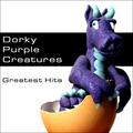
| 07/26/2004 11:14:12 PM |
Dorky Purple Creaturesby mandypComment: I love the dinosaur and the egg, but the rest of the composition just isn't working for me. The black and white seem so disappointing with such a fun and exciting focal centerpiece like the dragon. |
| Photographer found comment helpful. |
| 07/26/2004 11:13:00 PM |
|
| Photographer found comment helpful. |
| 07/26/2004 11:11:02 PM |
Deranged Pink Catby GalimagesComment: There are very few cases where a fuzzy border helps a composition, and this is not one of them. That said, I got a good giggle out of this cover. |
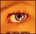
| 07/26/2004 11:06:37 PM |
Deep Purple Corneasby ScantyNebulaComment: I know the text and border are purple because of the band name, but I think the contrast might be more effective if they were much darker -- maybe even black. Great photo, though. |
| Photographer found comment helpful. |
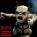
| 07/26/2004 11:04:03 PM |
Demonic Plastic Creaturesby mocabelaComment: The photo is technically and aesthetically perfect. My only complaint is the jaggies on the text, which can be easily fixed with anti-aliasing. 9! |
| Photographer found comment helpful. |
| 07/26/2004 11:00:19 PM |
Demented Problem Childby bruskiComment: This one looks like something I'd see on the racks, so well done. I especially like the desaturation of your photo. |
| Photographer found comment helpful. |
Home -
Challenges -
Community -
League -
Photos -
Cameras -
Lenses -
Learn -
Prints! -
Help -
Terms of Use -
Privacy -
Top ^
DPChallenge, and website content and design, Copyright © 2001-2024 Challenging Technologies, LLC.
All digital photo copyrights belong to the photographers and may not be used without permission.
Current Server Time: 04/25/2024 02:51:31 PM EDT.