| Image |
Comment |
| 06/30/2004 03:25:29 PM |
d70.by the-O-sterComment by soccerdad: This is pretty interesting all the way around. Glasses give just a hint of mystery with the lens reflection fitting the overall theme, camera gives a hint of context, and the crop, though very tight, doesn't hurt the overall image. A little more light on the right side might have improved this enough to move it from 8 to 9. |
 Photographer found comment helpful. Photographer found comment helpful. |
| 06/29/2004 09:28:31 PM |
d70.by the-O-sterComment by photom: Unusual but effective composition. Exposure and focus right on. The reflection of the red light directly in front of the eye is distracting as is the bedpost and black object reflected in the glasses. |
| Photographer found comment helpful. |
| 06/29/2004 01:51:14 PM |
d70.by the-O-sterComment by dacrazyrn: I like the compostiion and light, but the reflection in the sunglasses is a touch distracting. Is that a loose sock out there? |
| Photographer found comment helpful. |
| 06/28/2004 08:41:50 PM |
|
| Photographer found comment helpful. |
| 06/28/2004 06:15:30 PM |
d70.by the-O-sterComment by Philos: I have "the other camera" and I am not realy crazy about the reflections in the sunglasses.
It's a good shot, it's in focus, it meets the challenge, lighting is good, idea is good, composition is good but now WOW factor here so I can only give you (6) |
| Photographer found comment helpful. |
| 06/28/2004 12:52:53 AM |
d70.by the-O-sterComment by justine: Only negative comment I have is the reflection in the glasses. I think the tripod should of been moved to clean that up some. Over all I like this. Good entry. |
| Photographer found comment helpful. |
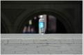
| 05/18/2004 11:54:49 PM |
Litter.by the-O-sterComment by awpollard: You got it dead center I got to admit. Technically a well organized picture with balanced negative/positive space, the dof is excellent. Shot well taken. |
| Photographer found comment helpful. |
| 05/18/2004 07:49:55 PM |
Opposite Worldsby the-O-sterComment by justine: Really a good find for the challenge. I hope people will look long enough to see....
? Good job but may be too subtle. |
| Photographer found comment helpful. |
| 05/18/2004 04:58:33 PM |
Opposite Worldsby the-O-sterComment by 16point2mm: Great concept, fantastic angle, and the blur of moving person in the foreground opposed to the still figure in the background all lend this shot a good number. But since your main focus is on the text in the picture, a greater depth of field would have been appreciated, creating a greater legibility of "downtown". |
| Photographer found comment helpful. |
| 05/18/2004 09:41:24 AM |
Opposite Worldsby the-O-sterComment by dahved: I like it! You've nicely contrasted black/white, up and downtown, foreground/background and blur and focus. 8 |
| Photographer found comment helpful. |
Home -
Challenges -
Community -
League -
Photos -
Cameras -
Lenses -
Learn -
Prints! -
Help -
Terms of Use -
Privacy -
Top ^
DPChallenge, and website content and design, Copyright © 2001-2024 Challenging Technologies, LLC.
All digital photo copyrights belong to the photographers and may not be used without permission.
Current Server Time: 04/18/2024 01:11:59 AM EDT.