|
|
| Image |
Comment |
| 10/07/2006 05:40:29 AM | Swirl No. 9by danderson107Comment: Definitely has cleaner lines than the original and that aspect of it is really letting me enjoy the simple curves being shown. The other one was great (as your placing helps show) but I do like this interpretation just a little bit better. |  Photographer found comment helpful. Photographer found comment helpful. |
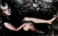
| 10/03/2006 08:42:06 AM | Grainby escapetoozComment: I really like the rawness of this image. It has a sort of "punch you in the gut" attitude.
I especially find the choice of environment to be of great interest. The rock face lend itself to its raw, dirty quality and yet the model (not sure if that's you) helps balance the image out because there is a softness there in the gaze (despite its directness), position and the visible skin.
There's a bit of a surreal atmosphere around the model, her skin doesn't look completely realistic, but its not so much that it has that plastic look I often see from shots that are NeatImaged to death. Maybe its just how pale it looks in some areas, not sure!
I'm facinated with how shiny the hair looks, and how the dark roots contrast with the blonder areas, it has an almost metallic look to me and I find myself focusing on the hair a bit. Not a bad thing, just something I thought I'd mention.
The position of the model looks a little uncomfortable but her face doesn't show that so that thought sort of stays in the background. I do like the way she is posed however. The point of view is excellent as it allows for that fantastic direct gaze and the whole body is almost laid out for viewing which in my mind makes the presentation more complete than if only portions of the model's body was visible.
I think the lighting has been handled very well and I don't really see anything I would suggest changing in that, I like the deep shadows and how the lighting helps further that raw look I first mentioned.
I think this is an excellent image, whatever you did with your post-processing was very well envisioned and achieved and you obviously had a great image to start with. If there was anything I'd suggest changing, its a tiny nitpick of the bit of white - maybe a belt? - seen just below the arm in the bottom left-hand corner. That smidge of light breaks up the shadows and does draw the eye just a little and since its not something I'd consider a important aspect of the image as a whole, it becomes something of a distraction.
Still, that's a very small distraction and there is plenty of other details for a viewer to get lost in here and it has been a pleasure to take the extra time to look at this photo in more depth. | | Photographer found comment helpful. |
| 10/03/2006 08:11:42 AM | Be Happy!by wingyisleedsComment: This particular image was the first that caught my eye and although comments have already been made I figured I'd add my thoughts too.
Since I'm not voting on this as the challenge is over, most of my commentary will not be about the challenge requirements - though I think it meets the challenge just fine.
Now that said, I'll get into some of the technicals (mind you I'm no expert so keep that grain of salt handy). Firstly, I think the overwhelming issue I notice before all else is the head position. As mentioned it looks TERRIBLY uncomfortable. While it may not have been, the impression actually does leave a residue on how I view the image, and does so negatively. I think its the combination of her head being turned to a rather extreme-looking degree and her head then being tilted upwards as well and the smile looking just a bit forced as a result.
I would suggest having her lower her chin so that it is parallel to her shoulder or even slightly lower so its pointing down towards the shoulder region - this will need to be adjusted depending on if she has looser skin around her neck as you don't want to show more wrinkles or double-chin if that's an issue (from this view it doesn't look as though it would be, but you never know!). I would also suggest bringing her head in towards her center more - I think a good starting point would be to have her head in line with the outer edge of either the left or right breast. This should give a nice angle to the head and yet not be quite as extreme as is shown here, depending on what side you/she considers her best side would determine which direction to turn the head.
Next is the focus, which has been mentioned as well, I don't think the focus is terrible by any means, there is a sort of blanket of softness but its not blurry. With portraits I like to see very sharp focus on the face, and most especially the eyes. If the eyes are sharp then a softer focus radiating outwards from there is acceptable (if handled correctly), though if you can manage a sharpness throughout the entire face, all the better IMO.
The lighting is a bit flat, though I don't know if some of that is due to the transition to B&W or not. I think two lights, one shining straight on and then another coming in from about a 45 degree angle to clear out any stark shadows the first light created would be worth trying. If you have a reflector that you can shine the 45 degree angle light into and bounce onto her face that may help and if you have a diffuser (home made ones can be created from tissue paper or even white trash bags) that would help control the main light too. This might address some of the bright reflections on the cheek and nose. Not sure if some makeup powder would help that too or not.
Compositionally, I think filling the frame with her face was a good choice, if the angle wasn't so extreme then I'd say the composition was nearly perfect - Cropping just a bit from the bottom so the smidge of shirt was gone would clean up that area some and being aware of the environment is key as the bands of black& grey up at the top push the image balance way too the right and looks somewhat out of place.
Not having seen the original of this, I cannot say whether B&W was the best choice. There are a lot of midtones here which end up translating into greys or softer blacks & whites which don't give you that nice crispness you can see in other B&W images. This abundance of grey tones also tends to have the effect of making the image look dull or sort of washed out.
The headband does make for a really nice line and a definite contrast that is pleasing to the eye. I wish there were more sharp contrasts like this, it would really add drama to the image. The other thing about B&W is it washes out the color of the eyes, sometimes if the eyes are really really light or really really dark this can work in the images favor, but if not, then a large point of interest can be lost.
Sooo, after all that I'd say, the key points for this particular image are: focus, position of your model's body parts and your model in the environment. Even with the the current lighting and the flatter grey tones shown, an adjustment in those three areas I think would improve the image greatly.
Hopefully, there is something of use for you in all that babbling, I'm no portraiture expert but I do know what I like to see as a viewer! By the by, I think the voters were overly harsh with this image. I don't see it as a below 4 image. | | Photographer found comment helpful. |
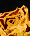
| 10/01/2006 02:38:00 AM | Valley of the Roseby cryanComment: Interesting abstract quality here. The harshness in the light and the straight black background give the image a sort of stark, desert-like feel to me. Yet, I also see some very interesting shapes emerging from the close up view. The super focused portion looks almost like a snake's mouth open and rising from its den. Either way, there is definitely a darker feel to this shot than the normal rose/floral shot.
As I mentioned the light looks pretty harsh, but whether that's a bonus or a detriment really depends on what you're going for. Something more inviting that draws the viewer in and tells them to get comfortable might require some softer, more diffuse light than is here. But if you're going for the starkness, something that definitely draws out a lot of texture and other details, then I think the brighter/harsher light was an excellent choice.
I like the composition for the most part. Much of the focused area is easily viewed, there are a good number of points of interest in that focused area. The unfocused parts, particularly in the back, help frame those areas that have the sharp focus. The background part of the rose I don't find distracting at all, however the unfocused foreground portions are a little too prominent for me and do detract from my enjoyment. If they were somehow less of an impact, I think that would help the shot even more.
I love all the bumps and curls that the rose has to offer, you can get lost in the different shapes available here and you've drawn them out very well and despite the extreme differences in focus throughout the image, there are more than enough points of interest for the viewer to enjoy.
I also like the color of the flower, its darker tones help compliment the feeling I get from the shot, it highlights the textures which I think would easily be lost in a more pastel color. You were able to get a nice richness in the darker yellow which is nice, I've found yellow to be a difficult color to shoot sometimes because of how the light seems to react to it. I think this darker tone helps alleviate some of those typical issues. The coloring also extends the old, withered aura the rose has, though that doesn't really seem to be important to the subject currently on display.
A very nice shot and not bad for a first try with a new lens. It certainly has a lot to offer a viewer and has been well presented too. | | Photographer found comment helpful. |
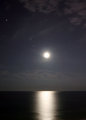
| 10/01/2006 02:02:01 AM | Moon Reflection (cropped)by renegade1966Comment: I absolutely agree, I think this looks much better, it has such a soft, ethereal look to it. I love that the stars are still there and they seem even more integral to the shot now. Excellent capture and much improved with the additional processing. | | Photographer found comment helpful. |
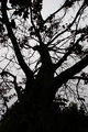
| 09/19/2006 09:45:01 AM | Spidering Branchesby cresusComment: You have some wonderful images that you've submitted to challenges so far and though they were tempting to comment on I decided to go with this one since it wasn't quite as well received as the others.
What I like about this image is the strength visible, both in the depth of the silhouette (some folks' silhouettes aren't true black and seem weak for that and other reasons) and the choice of subject that has an inherently strong aura.
I agree with scarlett about the abstract feel to this, it is clearly a tree and its branches yet the scattering of lines and dollops of shapes from the leaves still allow it to hint at abstraction. When I look at it I see a tree but I also get an impression of an ink spill where you have a large blob then the rivulets spreading out in many directions.
I also like the fact that your background isn't glaringly white. The greyish tone of the overcast sky allows the black to be strong but doesn't attack the eyes like a more blown out sky might - the contrasts are still there to be enjoyed with out a visual assault.
Mind you a blown out pure white sky can be a perfectly fine background, I'm just liking the one here, though I wonder if the background was a 'pure' white if that would've struck the voters more positively as the grey does make the image a bit more subdued that some voters tend to like - at least in my experience. If it were possible to lighten it up just a bit without losing the nice smooth greyness, that might be the best of both worlds.
Something I don't like is the composition. Not entirely of course, as I mentioned before there are aspects I do find very strong and that I can find correlations to other things with, but my main issue with the composition is the bottom portion.
I don't find the hedge/bushy tree at the bottom to be nearly as strong or intriguing as the branches are and the current arrangement doesn't allow for that part to add to the image IMO. If the branches seemed to mesh with the bushier tree and look as if it was naturally growing from there, it might work more for me, but the nature of the bushy tree doesn't really allow for that - the piney-jagged stuff doesn't really gel with the branches.
I think cropping out a fair portion - or all if it if possible - would bring the attention to the main subject of the branches and give the image a slightly different dynamic, leaning more towards the abstract nature as well.
There is also something missing from the shot, a "wow" factor that is typically looked for in the challenges, I'm not sure if its the low lighting muting the image too much or something else. I think it has all sorts of great qualities yet as much as I like those individual aspects, when they pull together for the image, its almost like they get homogonized and lost in the whole of the shot. I really wish I could pin point an action that would push the image to the next level but I'm not sure what it is. I'm guessing a more dynamic lighting (while keeping the silhouetting of course) might be an idea but that's just speculation.
I don't know that this has been of any actual help, since I haven't really given many concrete issues and solutions but for what its worth I think the shot was likely rushed through in many cases during the voting, I think if more time was spent the more subtle areas of interest would've become apparent and your score would probably have been a bit higher, I don't think it is a 4.5 shot in my humble opinion. | | Photographer found comment helpful. |
| 09/18/2006 06:57:37 AM | Washington Monumentby cfischlComment: Washington DC in the spring is so beautiful and you've captured one of the reasons right here.
I really like the composition you chose here. You have the obelisk of the monument rising straight through the middle of your image which is typically considered a no-no, but the line is so nicely softened by the cherry blossom branches cutting across it.
I think the clarity is good for the most part though there seems to be a bit of sharpness missing - I'd actually love to see this with a more intensional soft focus going on, I think that kind of misty mood would really play well with the soft blossoms and balance out the strength and rigidness of the monument (I'm thinking along the lines of the blue winner in the first soft focus challenge "My First Christmas Tree" by Sonifo).
The lighting is a bit troublesome. It isn't bad, just a little too bright, maybe a different time of day would be better, particularly since there is so much white in this image its guaranteed to reflect all the light coming in so not as much would necessarily be needed. Also the softer light from more morning or evening would help extend that soft focus idea as well.
I'd lean more towards a soft morning light than an evening light since the evening light would probably be tinged with warmer colors - which in itself wouldn't be a bad thing, might add some nice color to the image - but continuing on with the clean crisp feel that shot already has, the cooler morning light would likely be a better fit.
I think this shot has all the elements it needs to be first rate and it is lovely as is, I just think it needs a little unique something to push it into another level and distinguish it from other similar shots. I think if done right the soft focus idea would do that - add a dreamy quality - but it is absolutely not necessary. You've a fine image already. I enjoyed taking the time to soak it in. | | Photographer found comment helpful. |
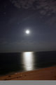
| 09/18/2006 06:44:25 AM | Moon Reflection.jpgby renegade1966Comment: This is a magical image. I absolutely love the smooth metallic feel to the water and then to have the moonrise and some stars visible in the sky? Excellent.
I'll echo a few thoughts already mentioned by other commenters. First and foremost level out that horizon. It'll make a huge difference in the balance of the image. Hopefully it won't cause you to crop out that bright star on the left but between a level horizon and the star, the horizon wins.
Also the balcony ledge is adding a yucky grey tone to this image so that should be cropped out, and really the beach's brown tone though nice doesn't seem to fit the cooler hued, more darkness intense duality the sky and ocean have. I'd crop that out completely as well.
What that will leave is a fantastic play of two elements, the ocean and the sky, both have some nice dark qualities, the ocean offers a strong base, some fabulous smoothness, a metallic sheen and that wonderful moon reflection line. The sky then let's this image breathe, lightens things up just a bit and helps enhance the expansive feel of the ocean. Not to mention the hint of clouds in the horizon and upper corner and also those wonderful accents - the stars.
Typically I think it would be nice for the moon to be more detailed and less a ball of white, but here I think with how well the dynamic between the water and sky work, the moon is much more of a secondary player, there to help enhance the mood of the two elements rather than play first fiddle. Of course, were the moon to have some of the clarity and focus that are evident in the other moon photos I saw in your portfolio that would proabably elevate this image even more.
I keep scrolling the image to ensure I examine everything but I have to say I love how it looks when I crop out the bottom portion. I think you could also safely crop out a bit of the sky and still keep the same dynamic - since the sky is much more prevalent than the ocean you have some room to crop. But I would caution not to crop too much because the ratio of sky to water is one of the backbones that gives the shot strength. I'd say no more than 3/4 of an inch of the top.
I think this is a great capture and with just a bit more fussing it can shine even more, but you've done an excellent job getting a great starting point. | | Photographer found comment helpful. |
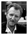
| 09/18/2006 06:25:50 AM | Portrait-1.jpgby abcmorganComment: It has been a delight to look through your portfolio, you may not have a large number of images up but they are all excellent. You have a wonderful eye for B&W photography and that just happens to be my favorite kind!
I decided to do my indepth comment on this image, primarily because it didn't have any comments yet, all of your other shots are excellent from what I've seen so I couldn't think of another way to choose amongst them.
First and foremost the B&W choice was good here, there's nice strong blacks and clear whites which help make for a good B&W image. The greys are limited which is nice since that tends to muddy up B&Ws in my opinion.
The focus is spot on, you've some very nice clarity in your subject's face and the background is a pleasing blur, nothing stands out there focus-wise as a distraction. That said I do find the face? in the background to be a bit distracting since its lighter nature is surrounded by a deep black so it shows up more. The table or desk that's in the background doesn't have this same issue mainly because its a large mass and that helps it blend itself into the background but that small thumbprint of a light face really draws my eye away from the main subject and I can always see it in the corner of my vision field when I am studying the man's face. Perhaps cloning it out so there's just a dark blob there would help.
I think the lighting works well here, there is an even gloss of it over the entire image and then a more intense beam coming in from the left that helps create some nice shadowing on the man's face and highlights his beard and mustache. I do think its unfortunate that the light didn't extend enough to light the area of his eyes more though. There's a wealth of experience and interest in his eyes from what I can see right now, I think that would be drawn out and more readily evident if a bit of a fill light or reflector had been placed to the lower right. That may not have been possible though, it looks like there may been a candid aspect to this image so setting up might not have worked - don't know for sure though, that's just speculation.
I think the composition is good, I like his head tilt, it keeps the image from being balanced too much to the left and the blurred background gives just a hint of an atmosphere to the image. Not enough that I can determine where you are and what's going on, but it has its own dynamic that leads me to believe there is activity and that adds a to the image in a subtle way for me.
My favorite part of this image is the man's crow's feet, they make me envision him squinting into the sun often, laughing often, and possibly even crying often. There's a so much of life's experience in his face and a lot there for a viewer to study, but its those simple wrinkles by his eyes that I'm facinated with, then I get lost in those eyes trying to think of what his life has been like, he could be anyone and experienced anything and its all there in those eyes (which is why I wish they were just bit better lit).
I really hope you add more images to your portfolio, I can't wait to see what you'll share with us next - your touch with B&W is impressive and I hope I can attain as much success with the genre some day. I've added you as a favorite photographer so I can keep an eye out for anything new. Good luck with your future creations! | | Photographer found comment helpful. |
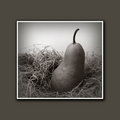
| 09/18/2006 06:04:26 AM | Pearby persimonComment: I like your ability to take common foods and make them look interesting. I looked at both the pear and the garlic shots and thought they were all very good. The pears are the most interesting to me and this one topped the list.
What caught my attention here is how you've brought the viewer in to the image and centered them on the pear with the darker shading around the outer edge of the photo. That addition makes my eyes skate over the edges and to the lighter areas and then to the pear itself.
I think the composition here is excellent. There is a nice duality between the straw which has a strong horizontal pull and the pear with its more vertical positioning. The contrast is furthered by the darkness of the pear and the light squiggles the straw brings to the image.
The focus looks great, it has enough sharpness to make the image look clean in that regard yet there is also a softness to it that allows the viewer to sort of float over the image and take each item in. There are no harsh lines and the shadows are there but have been gentled so they aren't dominating the shot.
I think the lighting here is great, whether it was so controlled from the outset or is the product of some great PS work and design, it has just the right amount of intensity and it highlights what needs to be highlighted and just brushes over the areas that aren't as important.
I think that light grey banding along the inside of the image really helps take it up a notch and feeds a certain mood. That was very well envisioned and exectuted in the post processing. Without it, the image would be entirely different and I don't think nearly as successful.
As much as I like the shot there is one area that I don't like at all and that's the border. I think the image is very strong and can easily carry the thin white border that's directly around it, but the thicker border just overwhelms the image to me. I do see that its color is a nice enhancement, it helps tie itself to the image, but I think that could be easily accomplished with something a bit more subdued in size. The image is of course automatically set off by the size of the border which is nice but even with those positives I just find the border to be unnecessarily large and thus a bit of a detriment. Not enough to ruin the image of course, but enough that as I sit and look at the picture my primary thought is "I wish the border wasn't there/so big".
Still, that's more of an aesthetical preference and I'm sure others don't mind it. I think overall this is a fantastic image and it really shows what a little creativity and forethought can do for a common item like a pear. I hope others find this as intriguing as I do and have bought a print. :) | | Photographer found comment helpful. |
Home -
Challenges -
Community -
League -
Photos -
Cameras -
Lenses -
Learn -
Prints! -
Help -
Terms of Use -
Privacy -
Top ^
DPChallenge, and website content and design, Copyright © 2001-2024 Challenging Technologies, LLC.
All digital photo copyrights belong to the photographers and may not be used without permission.
Current Server Time: 04/18/2024 04:02:11 PM EDT.
|